Building a Design System in Elementor
Introduction
One of our clients DAT required to lift and shift their website from Processwire to WordPress. After evaluating Gutenberg and Elementor, We finalized Elementor as the visual page builder owing to the advantages it offered. Building a design system in Elementor emphasized structuring SCSS/CSS, using Elementor's Site Settings for global styles, and extending Elementor with custom API integrations. Read further to dive deep into the process of building a design system in Elementor.
The Client Use-case
Our client DAT (a leader in freight & analytics) approached with a lift and shift requirement from Processwire (CMS/CMF) to WordPress. Their requirements seemed quite modest from content management perspective, the project kicked-off with new challenges on both front-end and back-end. In this insight post we’re going deeper into cracking those front-end solutions that emerged with flying colors.
Front-end woes?
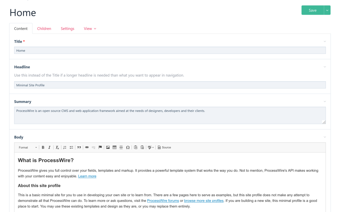
Striking the right balance between functionality and usability was crucial, for as someone coming from a refined platform like Processwire it’s more of a challenge in itself moving away to a conventional platform like WordPress. When it comes to content editing experience Processwire is UI agnostic, there are no fancy visual builders, rather plain vanilla UIKit components and fields to move around (more like Drupal). As seen in below screen:

Shaking the WordPress tree… we took first swing at the Gutenberg editor. Simply put, it’s a lightweight visual builder with very less verbose markup. Given it’s simplicity, it was worth exploring until it boiled down to building and customizing Gutenberg blocks for certain components like Slideshow, Accordion, Pricing Tables and Tabs. The sheer size of DAT content was whopping 3k+ including pages, blog posts, and news. Risking it all on Gutenberg seemed butterfingered, the evaluation finally gravitated towards Elementor, because of it’s professional backing, documentation, community and tech support, and the ease of building or extending core Elementor widgets effortlessly.
Structuring the SCSS/CSS
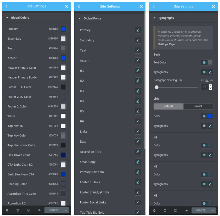
Now that the visual editing experience was in place, it was time to formalize base SCSS/CSS structure. Starting from Elementor 3.x one the best features so far is Site Settings, a global space to customize your sites Colors, Fonts and Typography. Refer below:

This gives you enough ground work to begin with, but not enough. A slithering and bugging issue with building a large scale site on a visual builder is performance and consistency. While Site Settings remedy half of the pain, spacing's, gutter widths, margins and padding's are equally important to formalize. This is where Site Settings fall short! But all is not lost, we went with a native solution of defining them as Elementor extensions using their API’s. It not only solved the other half of the problem but also ensured there’s consistency with spacing’s across the site. Using default Elementor margins/padding’s is debatable as long as you don’t loose overall control, it seemed rather careless to go along that path.
The solution emerged from mix of CSS variables and extending the core Elementor Section and Column widgets. Combined with a sprinkle of Bootstrap 4.x SCSS/JS utilities it spearheaded for a crazy spin. At the core of these spacing's we wrote mixins and map constructs with standard spacing. Let’s checkout the mappings:
The honorary mention here is rem-calc mixin taken from Zurb Foundation. We’ll be taking one more closer look at REM’s at the end. Taking early influences from 8px grid, the spacing’s are now almost standard, paired with key and value. Now it was up to CSS variables to do the real magic, with some additional convenience classes to support these variables. The final construct for CSS variables goes like this:
When compiled it should output CSS like this:
Just the tip of iceberg, there’s more. Covering last bit of this puzzle with Elementor API’s, i.e. actually defining our extensions for Section and Columns to use these custom spacing’s.
Extending Elementor with API’s
Gauging with an action hook elementor/element/before_section_end function into Elementor as documented in Elementor API’s. Using this action hook in a function we can customize, remove or add some of the base Elementor controls like Text, Select, Number, Switcher, Button, Heading, Tab, Fonts, URL, DateTime, Animation and even some more advanced controls with responsive settings. Keeping things simple for now by adding two controls, one for vertical margin and other for vertical padding like this:
The if condition filters out exact position where we want it i.e. in the Section Layout tab and whether the element itself is a Section. Then picking up the returned element instance we start injecting our custom controls. Notice the $element->start_injection(['at' => 'after', 'of' => 'gap']); and $element->end_enjection() which tells Elementor that we’re done adding controls. One more thing to observe is prefix_class option, this class is prefixed with the option selected, based on key value pairs. For eg.

In this case it will add section-vm-lg and section-vp-default classes respectively to the section. The final step is writing convenience classes to handle these settings using CSS variables that we’ve already defined previously. For DAT we had to customize a lot on CSS part and the way these settings are handled across browsers and devices, even within Elementor. Moreover it made more sense to use margins for vertical spacing's (wherever applicable) and vertical padding's where a background image or background color is in effect. Leveraging one of the core concepts of margins also know as collapsing margins it made the spacing’s perfectly consistent without any layout issues, or any extra spacing's between two sections. Reason why they call it collapsing and not colliding!
Collapsing margins only work with display: block it doesn’t work with Flex layout or display: flex. The problem nagged for a while as Elementor bags up it’s own CSS making each widget to flex. To fix all these and with a little bit of tweaking for responsive spacing’s the final Elementor CSS customization looks like:
Rightly tuned up, these settings resolve majority of Elementor issues! For medium and small devices we went with grid-row-gap which affects only columns inside the container (not sections or widgets), as sections are still using collapsing margins. Now it gave perfect layout and spacing not just for sections but also for columns, specifically for medium and small devices. Just watch out for Safari, as it doesn’t support most of the grid functionality, including grid-row-gap and some more.
If there’s one thing that experience has taught us is to not using EM’s, not that they’re bad but just unpredictable if not used carefully. REM’s on the other hand have one single relative parent <html> (root) which makes it simpler to adjust font-sizes, line-heights, margins and padding’s in one go, without breaking the layout.
“Experience is the best teacher of all. And for that, there are no guarantees that one will become an artist. Only the journey matters - Harry Callahan”.
Useful References
- https://code.elementor.com/
- https://getbootstrap.com/docs/4.6/getting-started/theming/
- https://get.foundation/sites/docs/index.html
- https://css-tricks.com/what-you-should-know-about-collapsing-margins/
- https://css-tricks.com/confused-rem-em/
- https://caniuse.com/?search=grid