Enabling Component Based Design in Drupal

Introduction
Component-based design systems are quite common in product design because they enable consistency, coherence, and productivity in large design and engineering teams. Component-based design systems are somehow overlooked in websites as they’re one-off builds and don’t have ongoing dedicated teams. Enabling component-based design in Drupal outlines setting up different Paragraph types for various content structures, combining content with styling using Twig templates, and adding these components to content types. Read further to find out more.
In this article, we will discuss how we enabled this “Component-Based Design” approach in Drupal 9.
The Client Need
We redesigned and built a new website for our client Reynolds Brands: www.reynoldsbrands.com. As part of this launch, they required a robust set of components using which they could build their own pages by quickly assembling a few from the library.
The specific requirements for each of these components was the following:
- They should be able to “drag-drop” any component onto a page and assemble it quickly by themselves
- Each component should present a specific set of choices for entering data such as Title, Description, Images, Background Colors etc.
Below are a few examples of the components that were requested by Reynolds:
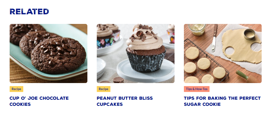
Related Content
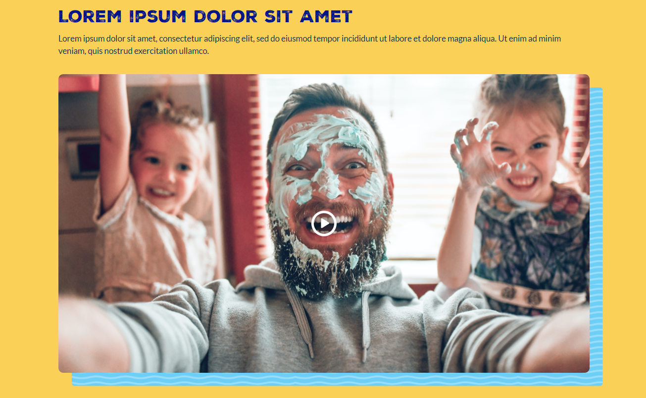
Single Video Section
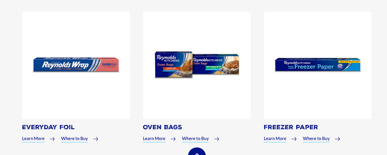
General Required Product

Three Column Related Product
Accordion

General CTA Promotion

Full Width Paragraph

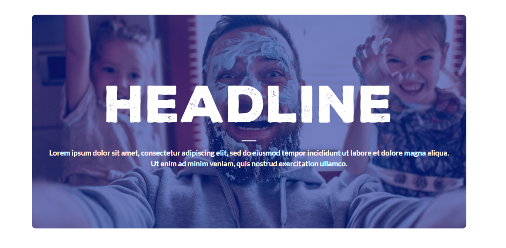
Text With Background Image
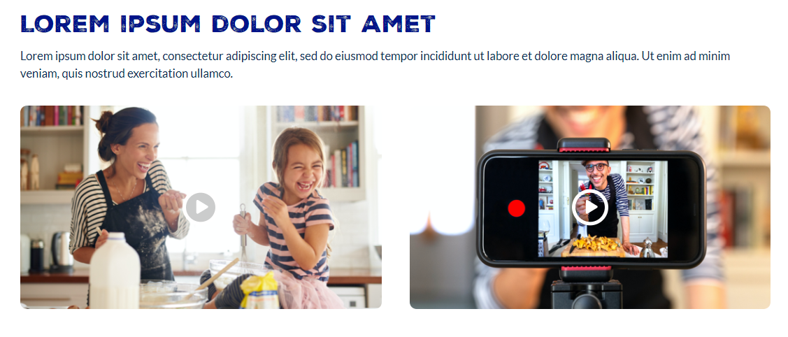
Two Column Video
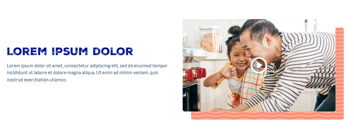
Text with Video
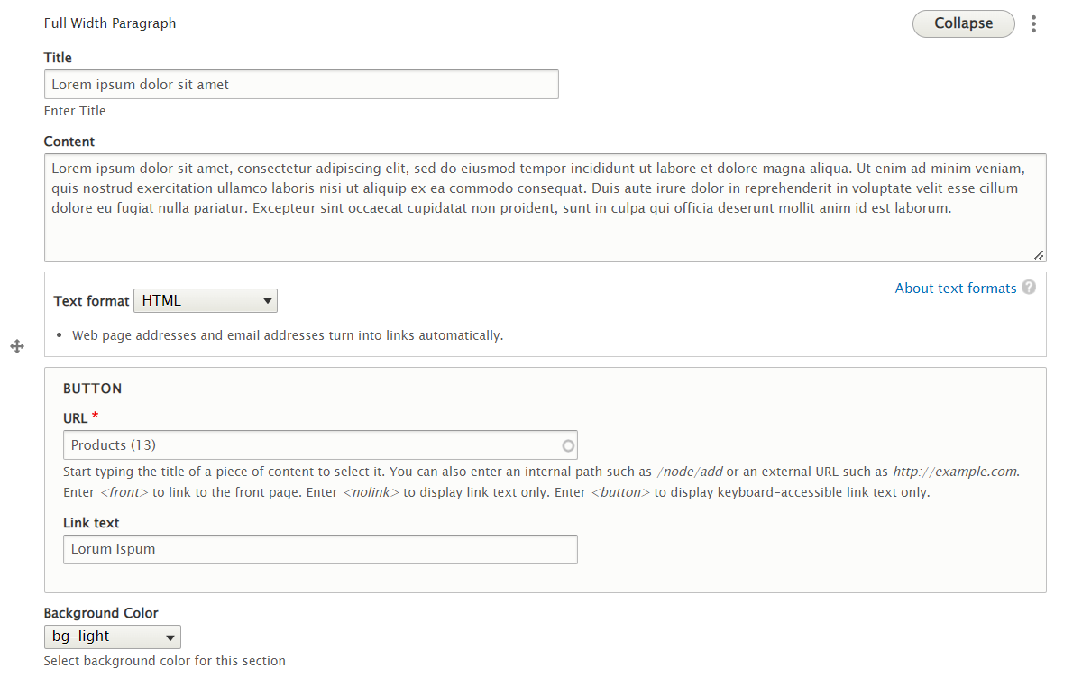
To elaborate, the content editing experience for a component like the one shown below, would be as follows:

Step 1: Create a new page and select the component (like shown below)

Step 2: Enter the relevant data into the component. In this case, that would be the title, description, button text, button URL and the background color of the section.

Step 3: Save the page and publish it! The overall point was to be super user-friendly and avoid any developer or designer involvement.
In the next section, we will describe how we achieved this in Drupal 9.
Architectural Approach in Drupal 9
Step 1: Leverage “Paragraphs” to model the content
Paragraphs is a new way of content creation. It allows the site builders to make things cleaner and can give more editing power to the end-users.
Instead of adding all the content in one WYSIWYG body field including images and videos, we can create multiple Paragraphs Types with different structures. This allows the end user to choose between pre-defined Paragraphs Types.. Paragraph Types can be anything you want from a simple text block or image to a complex and configurable slideshow.
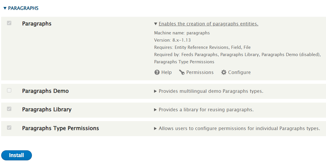
Paragraph functionality can be added to Drupal by simply installing the paragraph module.
Step 2: Combine Styling with the content
In paragraphs content can be combined with styling using drupal twig template. We can customize the HTML structure in the template based on the requirement.
Paragraphs uses twig template naming suggestions like core Drupal modules. The default paragraphs template is provided in paragraphs/templates/paragraph.html.twig.
The following suggestions are available, the most specific (used first) to least specific:
paragraph--[type]--[view-mode].html.twig
(e.g. paragraph--image--default.html.twig)
paragraph--[type].html.twig
(e.g. paragraph--image.html.twig)
paragraph--[view-mode].html.twig
(e.g. paragraph--default.html.twig)
paragraph.html.twig
Step 3: Add this component to a Content Type
Paragraphs module comes with a new "paragraphs' field type that works like Entity Reference's. Using this feature we can add a new paragraphs field on any Content Type you want and choose which Paragraph Types should be available to end-users. They can then add as many Paragraph items as you allowed them to and reorder them at will. All these features of paragraphs are what we need as reusable components.

Created Paragraph can be enabled in the content type using this paragraph entity reference as follows.
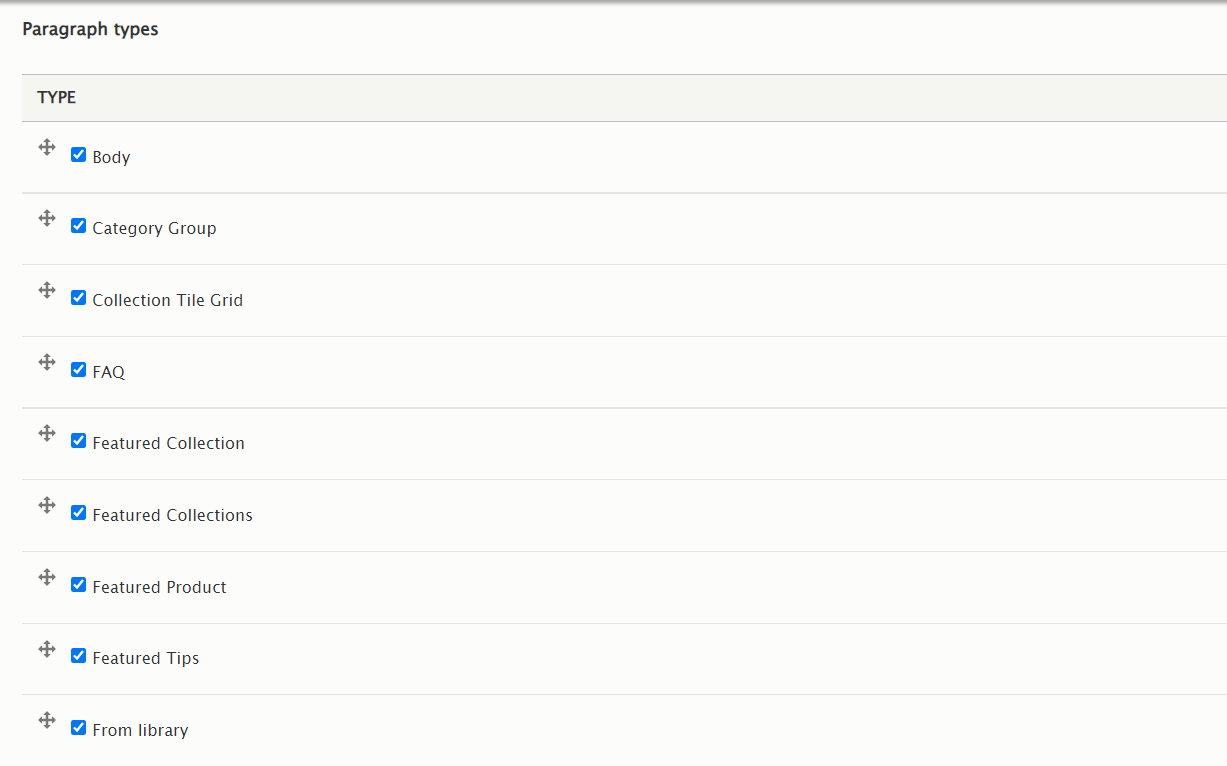
In the content type page, we can add the desired paragraph type using the reference field.
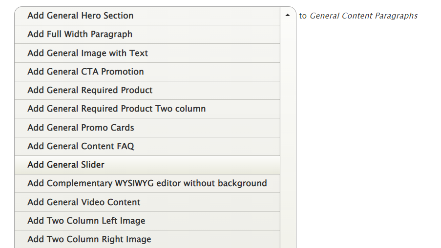
After adding and configuring the paragraphs in the page, we can rearrange the paragraphs by using the drag and drop functionality in the entity reference field.
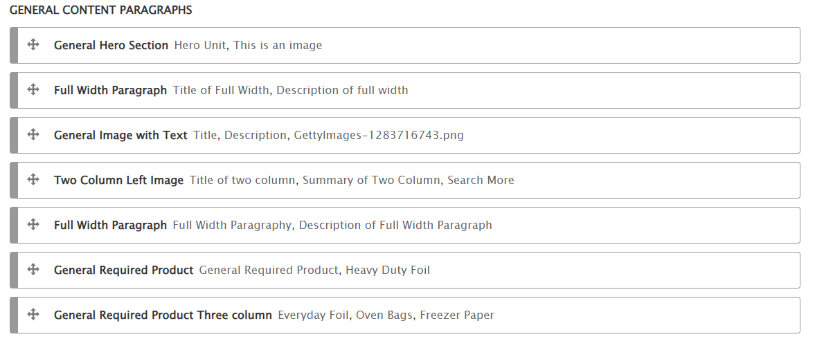
A Detailed Example
A General full width paragraph type is created using Structure → Paragraph Type → Add Paragraph Type.
Content fields for the paragraph type can be added and configured under the Manage fields tab.
We have added a Title and Content text field to manage the headline and description, a link field to add a button, and a list field to select a background color for the section.
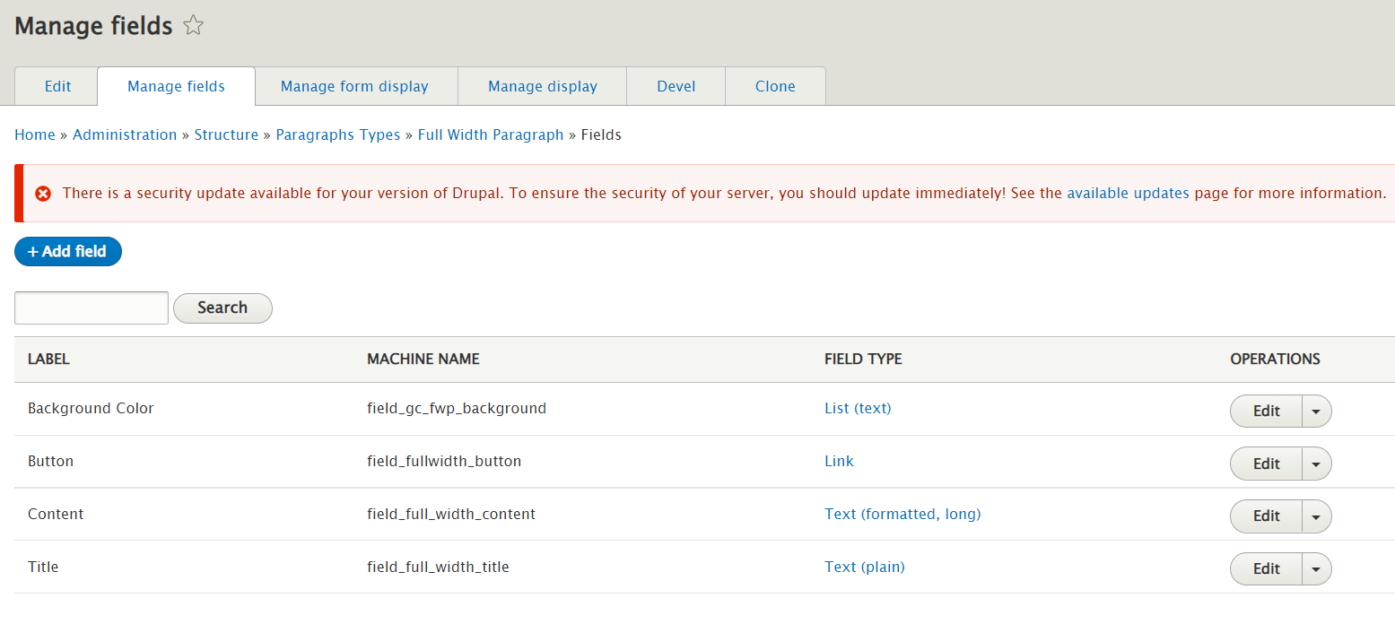
A twig template paragraph--full-width-paragraph--default.html.twig is created based on the twig suggestion. HTML code and necessary twig code is added to fetch the field values from the page.
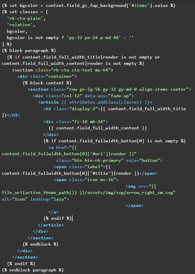
The paragraph type is added to the content type “General Content” and configured as follows.
The end result will be as follows.

In Conclusion, once you understand how to harness the power of paragraphs and combine it with the “content field” and style them within the Twig template, you can create a vast array of components to use throughout your Drupal websites.
If you liked this insight and want more updates, we’d love for you to join us on Linkedin, Facebook and Twitter.