
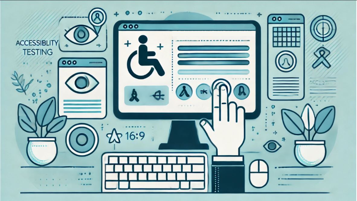
Testing for Website Accessibility Standards - WCAG, ADA and 508
Introduction
Making sure websites are accessible by everyone is not just a best practice; it is often a requirement by law in the current digital landscape. The three standards you'll encounter are the Americans with Disabilities Act (ADA), Section 508, and the Web Content Accessibility Guidelines (WCAG). These standards help to ensure that a website has the ability to be accessed equally by users, even with disabilities in their vision or hearing, cognitive impairments, and physical disabilities.
ADA: The Legal Requirements of Digital Access
The Americans with Disabilities Act (ADA) mandates that businesses and organizations provide equal access to all individuals, including those with disabilities. Initially focused on physical spaces, this requirement has been extended to the digital realm. ADA compliance ensures that a business’s website meets digital accessibility requirements, making its content and services available to the broadest possible audience. This is particularly important for e-commerce platforms, educational institutions, and public sector websites, where inclusive web design is critical for accessibility.
Failure to meet ADA website compliance standards can result in legal action. Courts are increasingly handling lawsuits related to ADA non-compliance, underscoring that digital accessibility is not optional. By adhering to ADA standards, companies can avoid legal risks and broaden their reach to include the more than 20% of Americans who have disabilities.
Section 508: Government-Focused Compliance
Section 508 of the Rehabilitation Act requires U.S. federal agencies and their contractors to make electronic and information technology accessible to individuals with disabilities. This standard is a key aspect of web accessibility standards for government websites and those working with government agencies. Although originally limited to federal entities, Section 508 compliance has expanded, impacting close-to-government contractors, suppliers, and federally funded programs.
Private businesses engaged in government contracts must ensure Section 508 compliance to maintain their credibility and avoid losing contracts. Failure to meet these digital accessibility requirements can damage the reputation of any organization in the public sector.
WCAG: The Global Standard of Web Accessibility
The Web Content Accessibility Guidelines (WCAG) outline how to create accessible web content for all users, regardless of disabilities. WCAG compliance is broken down into three levels: A, AA, and AAA, with Level AA being the most commonly pursued for its balance of usability and cost-effectiveness. These web accessibility standards are globally recognized and form the basis for many accessibility laws around the world.
WCAG 2.1 specifically addresses mobile accessibility, a crucial factor in today's mobile-first world. By following these standards, businesses ensure that their websites are not excluding the significant number of users who prefer mobile browsing, further emphasizing the importance of inclusive web design.
Accessibility Testing: Automated Tools vs. Manual Testing
Thorough testing is probably the most important step in meeting these accessibility standards. Automated testing tools like Axe, WAVE, and Lighthouse will flag many of the most common issues, especially those related to coding or structural elements like missing alt text or improper use of HTML tags. These tools only cover about 30% of potential accessibility problems.The rest, 70%, will require manual testing, where keyboard navigation, compatibility with screen readers, color contrast, and the functionality of interactive controls, such as forms, are checked.
Manual testing also includes the involvement of real users, especially with disabilities, by using assistive technologies like screen readers (e.g., JAWS or NVDA) or switch devices. Such users may provide very important feedback on the user experience, which is not captured by automated tests, thus giving insights into more sophisticated accessibility issues (such as confusing navigation or mislabeled elements).
Key Elements to Consider in Accessibility Testing
1. Keyboard Navigation:
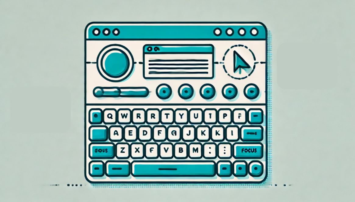
Users with physical disabilities often rely on a keyboard rather than a mouse to navigate websites. For these users, ensuring that every interactive element on the page (such as buttons, links, forms, and dropdown menus) can be accessed using only the keyboard is essential. Here are key considerations:
- Tab Order: Make sure the tab order of your site follows a logical flow, moving users from top to bottom, left to right, through content in a predictable manner. This prevents confusion and frustration.
- Focus Indicators: As users navigate with the tab key, it should be visually apparent which element is currently selected or in focus. This can be done by providing a clear visual cue, such as a border or background color change. Without a visible focus indicator, keyboard users may struggle to interact with key elements.
- Skip Navigation: Implement a "skip to content" link at the top of your pages, allowing keyboard users to bypass repetitive navigation menus and jump straight to the main content. This feature is especially helpful for users navigating through multiple pages.
- Keyboard Shortcuts: For users who may have motor impairments, consider implementing keyboard shortcuts that enable quick navigation to essential features or sections of the page.
Test your entire website using only the keyboard, focusing on navigating through menus, clicking buttons, filling out forms, and closing modal windows. Ensure all elements can be reached, and test whether users can backtrack or undo actions using standard keyboard keys like Tab, Shift + Tab, Enter, and Esc.
2. Screen Reader Compatibility:
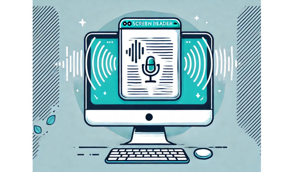
Screen readers are assistive tools used by visually impaired users to interpret and navigate websites through spoken word or braille output. Proper semantic HTML is crucial to ensure compatibility with screen readers. Here’s what to focus on:
- Semantic HTML: Use proper HTML tags to convey structure. For example, use <h1> for the main heading, <h2> for subheadings, <ul> for lists, and <button> for interactive buttons. This helps screen readers interpret content in the correct order and with appropriate importance.
- ARIA (Accessible Rich Internet Applications) Attributes: ARIA attributes can help screen readers interpret interactive elements like sliders, modals, and dynamic content. Use aria-label, aria-labelledby, and aria-describedby to provide additional context to screen readers for elements that might not be semantically clear.
- Alt Text for Images: Every image should have descriptive alt text that conveys the purpose or content of the image to screen readers. If the image is decorative, use an empty alt attribute (alt="") to ensure the screen reader skips it. Avoid redundant or vague descriptions like “image of.”
- Proper Labeling of Forms and Buttons: Ensure that all form fields have labels that clearly explain what input is required. Use the <label> tag or the aria-label attribute to associate the label with the correct input field. Buttons should have text that clearly conveys their function, such as “Submit” or “Search,” and avoid icons without descriptive text.
Conduct screen reader testing using popular tools like JAWS (Windows), NVDA (Windows), or VoiceOver (Mac/iOS). Test for readability, logical content flow, and whether essential visual content is accessible to screen reader users.
3. Color Contrast:
Sufficient color contrast between text and background is critical for users with visual impairments, including color blindness and low vision. WCAG 2.1 sets the following contrast ratios:
- Minimum Contrast Ratio (4.5:1): For normal text (below 18pt or 14pt bold), a minimum contrast ratio of 4.5:1 between text and background is required. This ensures readability for most users with visual impairments.
- Enhanced Contrast Ratio (3:1): For larger text (18pt or 14pt bold and larger), a lower contrast ratio of 3:1 is acceptable because larger text is easier to read.
- UI Components Contrast (3:1): Interactive elements like buttons, form inputs, and icons must have a contrast ratio of at least 3:1 against their background to ensure that users can clearly perceive them.
When selecting color schemes for your site, be mindful of not only text contrast but also non-text elements like borders, hover states, and iconography. Use tools like WebAIM’s color contrast checker to validate your color choices.
4. Multimedia Accessibility:
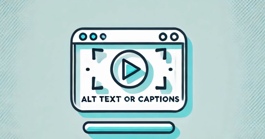
Multimedia content like video and audio can be engaging but often excludes users with hearing or visual impairments if not properly made accessible. Here’s how to ensure inclusivity:
- Closed Captions: All video content should include accurate closed captions that reflect all spoken dialogue and important sound effects (such as “door creaking” or “phone ringing”). Captions benefit users with hearing impairments as well as users who prefer to watch videos without sound.
- Transcripts: For audio content like podcasts, provide a transcript that includes both spoken words and any other relevant audio information. Transcripts also offer an accessible alternative for users who prefer reading over listening.
- Audio Descriptions: For videos with important visual elements (like instructional videos or movies), include audio descriptions that verbally describe the action, scenery, or important visual cues. These descriptions should be embedded into the video or provided as a separate track.
- Player Controls Accessibility: Ensure that media player controls (e.g., play, pause, volume) are accessible by keyboard, properly labeled, and readable by screen readers.
Test your multimedia with assistive technologies to ensure that captions are synchronized, transcripts are accurate, and visual content is communicated clearly to visually impaired users.
5. Forms:
Forms are often critical for user interaction, whether for signing up, making purchases, or submitting inquiries. Accessible forms must accommodate users with various disabilities by being both understandable and easy to navigate.
- Labeling: Every input field should have a visible and descriptive label. For fields without visible labels (like search bars), use aria-label to provide context to screen readers.
- Field Grouping: Use the <fieldset> and <legend> elements to group related form fields, especially in complex forms, so that users can easily understand the structure and purpose of each section.
- Error Identification and Instructions: Ensure that form error messages are easily understood and noticeable. Use clear, concise language to describe the error and how the user can fix it. Errors should also be conveyed programmatically to screen readers, using ARIA live regions to notify users as they interact with the form.
- Validation and Focus Management: When a user encounters an error, automatically move their focus to the problematic field. Use inline validation messages to immediately inform users if an input is incorrect (e.g., “Invalid email address”).
Simulate form interactions using both keyboard-only navigation and screen readers. Verify that all errors are properly communicated and that form completion is smooth and efficient.
6. Others :
Don’t stop at just the basic elements like text and images. Here are some additional areas to focus on:
- Icons: Provide text descriptions for icons using aria-label or visually hidden text. This ensures that screen readers can convey their meaning to users.
- Infographics and Charts: Offer alternative text descriptions or data summaries for complex visual elements like infographics, charts, or graphs. Ensure that all users can comprehend the information, even if they cannot visually interpret it.
Free Accessibility Testing Tools
Several free tools are available that can help you do both automated and manual testing for accessibility:
- Axe: A mighty tool that integrates with browser developer tools to unearth WCAG violations.
- WAVE: This is a tool that gives visual feedback about a webpage's accessibility. It indicates issues such as missing alt text or a poor heading structure.
- Lighthouse: Built directly into Chrome, Lighthouse automatically runs accessibility and performance audits to help identify issues such as low-contrast text or missing ARIA attributes.
Do not depend on one single tool; each one of them has its strong points and limitations. For instance, while Axe can easily help you find issues relating to code, WAVE can show you in a more graphical way where your website's design lacks quality. It is always good to use a mixture of tools with manual checks.
Conclusion
Full accessibility of web resources is never a "one-off" task. Web pages must be regularly tested and updated in view of accessibility standards every time an institution adds more content or new web technologies make their appearance to guarantee the consistent enjoyment of the rewards. An accessible website enhances user experience across the board, underlines an institution's commitment to inclusiveness, and reflects legal adherence.
Remember, accessibility is not only a compliance issue; it's about equality and a pleasant user experience for any visitor. Keep educating your web development team about best practices in accessibility, and make accessibility an integral part of the design and development process.
If you enjoyed this post, follow us on LinkedIn, X and Facebook for more.