What responsive breakpoints should we build for?

Introduction
Optimal responsive breakpoints for designing websites are 360px for mobile, 768px for tablets, and 1366px for desktops, and these choices are based on device market share, viewport statistics, and design considerations. The selection of these breakpoints ensures a consistent and optimized user experience across various devices. Read further to know about the details of how we arrived at the optimal responsive breakpoints.
The question we try to evaluate regularly is “What are the appropriate responsive breakpoints given the rapidly evolving landscape of phones, tablets, laptops and desktops?” It is common practice to design sites for three responsive breakpoints: mobile, tablet and desktop — for reasons of time and budget. While frameworks such as bootstrap offers multiple breakpoints (Link) it is not feasible — on live projects — to build and optimize for all of these. Timelines and budgets don’t permit it.
So, if we are constrained to looking at three responsive breakpoints, what should they be and how does one go about deciding? If it is a site refresh, usually the client provides sufficient information from their web analytics to make a determination. A sample chart is below:

Mobile Responsive Breakpoint
Why 360px for mobile? Considering the iPhone device distribution below, it is safe to say that designing for the iPhone 6 and beyond captures 80% of the market.
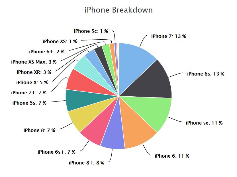
Ref: https://david-smith.org/iosversionstats/
And if we look at the viewport sizes for iPhone 6 and above, it is easy to decide that the lowest size should be 375px.
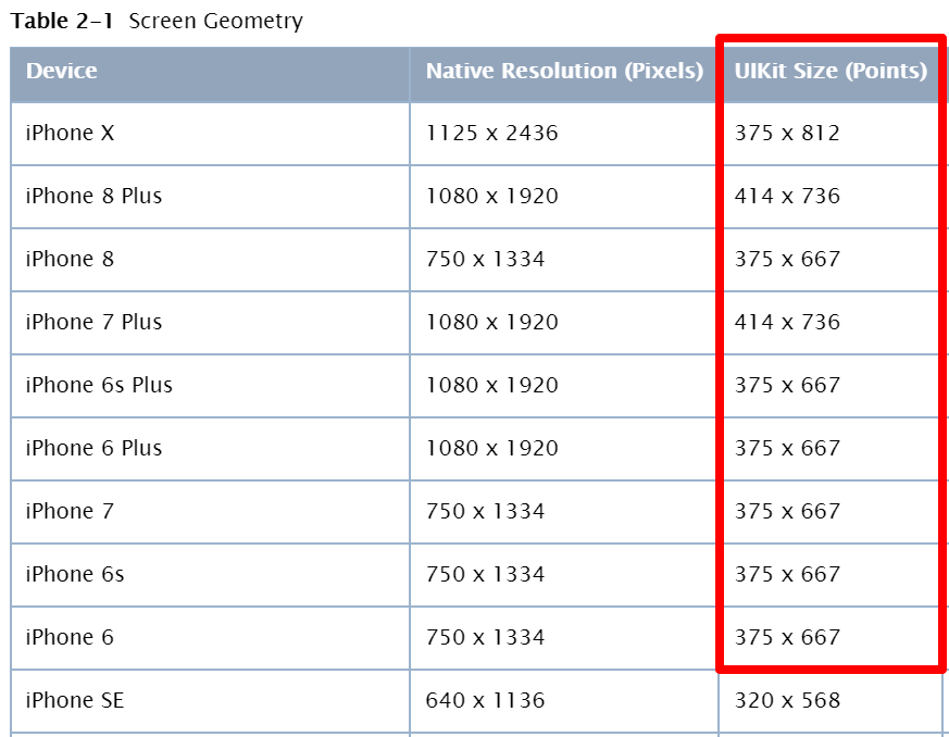
Ref: Link
So why do then we settle on 360px? For that, we have to look at the Android devices, primarily Samsung and Google.

Ref: https://mediag.com/blog/popular-screen-resolutions-designing-for-all/
As can be seen, most of the Samsung Galaxy phones come in at 360px while the Google phones are at 412px. That is why we recommend setting the mobile breakpoint at 360px. Another good way to summarize is to look at the global viewport statistics for mobile devices:
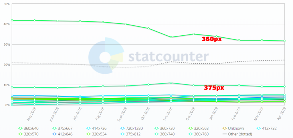
A key trend to notice here is that 360 while still dominant is reducing in market share while 375 is inching up.
Tablet Responsive Breakpoint
Selecting 768px for the tablet is a much simpler decision. If we look at the Apple market penetration, it is around 75%. So optimizing the tablet experience for the iPad is a good decision.

Ref: http://gs.statcounter.com/vendor-market-share/tablet
The viewport sizes for the iPads that comprise the majority of the majority are shown below:
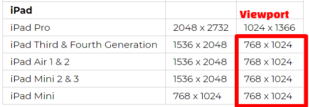
Ref: https://mediag.com/blog/popular-screen-resolutions-designing-for-all/
It is pretty safe to set the tablet breakpoint at 768 going by these numbers. Another way to summarize is to look at the global market share of tablets by viewport size:
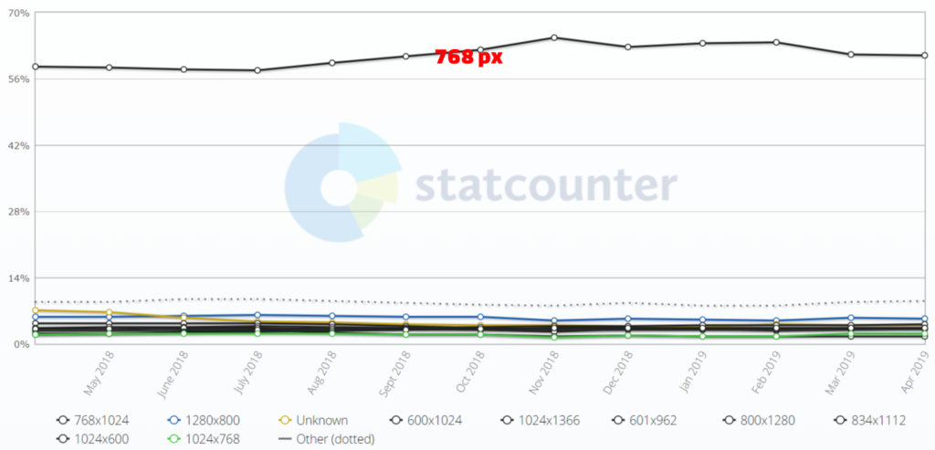
Ref: http://gs.statcounter.com/screen-resolution-stats/tablet/worldwide
Desktop Responsive Breakpoint
The desktop viewport market share is much more fragmented than that of the tablets or mobile devices. The chart below shows the distribution:
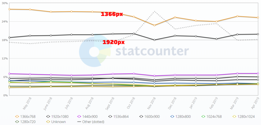
Ref: http://gs.statcounter.com/screen-resolution-stats/desktop/worldwide
The range from 1366 – 1920 captures more than 80% of the market share. Based on our experience with site design elements, we feel that 1366 is better to peg as the desktop breakpoint. Otherwise it leaves a huge gap between the tablet and desktop breakpoints where the design could falter.
You can also check out our post on techniques for efficiently testing responsive behavior.